How to draw Manga like a Pro » 10 pro tips
Introduction
So you want to draw manga like a pro... but don't know how? Then take a seat, because you're about to get schooled B]
If you thought that it requires endless amounts of practice and years of experience to unlock the secret chambers of professionalism, you'd be completely correct. But that being said, there are plenty of techniques you can learn in a matter of hours to dramatically increase the quality level in your manga, and that's no joke.
This is the first in a multi-part series that aims to present you with methods that you can apply immediately to add some seriously special sauce to your work, if you catch my drift.
Introduction over. Let's go.

Master drawing basic forms in perspective!
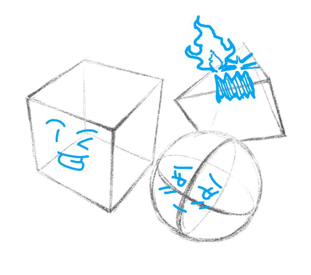
Beginners know how to draw squares, circles and rectangles.
Pros know how to draw boxes, spheres and cylinders.
"Wait, what's the difference?", you ask.
Simple: the former are flat 2d shapes, while the latter are 3d objects (also known as primitive forms or primitives) that are affected by perspective.
While this might sound mundane or even easy, getting good at drawing primitives has the potential of bringing your art to the next level.
Back to the basics
Perspective applies to all objects in the same way, whether they're simple or complex. So mastering perspective for primitives will help you tremendously when drawing more complex objects.
Knowing how to construct an object with the help of vanishing point projections is not what this is about, though. It's about getting an intuitive understanding of how perspective works.
So drop your ruler and start practicing drawing primitives from all kinds of perspectives. The point is to learn how to do it without using references, but you should compare your drawings to real objects or use guidelines in the beginning to make sure that they're accurate.
Try it out. How close do you get?

Distance dependent distortion
Simply drawing a lot of boxes and spheres is great and all, but it's even better to try and understand the principles that rule the world of perspective.
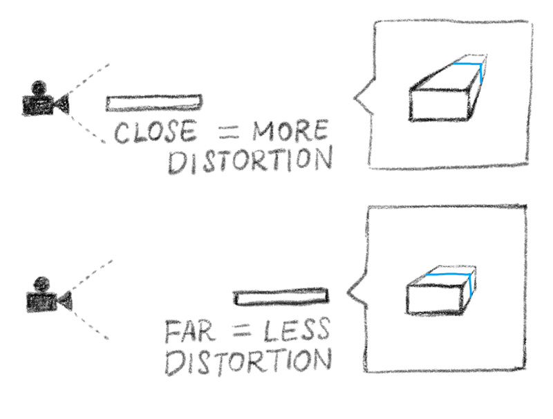
One such principle states that the distortion caused by perspective gets stronger the closer you are to the object. This principle has been famously applied in many movies in the form of the dolly zoom effect, Where the camera simultaneously zooms out and comes closer to the target, thus creating the intense effect of the background moving away.
Getting the hang of principles such as this one will open up a new world of stylish – and professional – effects for you to apply in your drawings.
Everything consists of primitives
It's very much possible to represent all complex forms through a combination of primitives.
In fact, this is also how our brains are able to remember what a particular object is, even if we view it from a perspective that we've never seen it in before (it's believed that our brains make use of only about 30 primitive forms called geons to construct simplified forms of ALL the objects we see around us).
"Blocking out" your drawings with primitives is a technique that many pro's use to ensure that the perspective and proportions of their artwork is solid before they start adding details.

Primitives make drawing complex forms simple
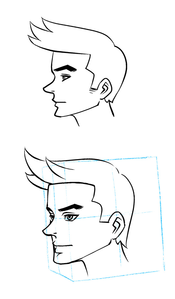
One of the most common beginner mistakes is to restrict your viewing angles to only the front or the profile, which leads to a very "flat" looking drawing style.
This is where primitives can make a huge difference. Even a simple cube can act as a super helpful guide for drawing your character in perspective, which can really bring your drawings to life.
PRO TIP 1: Learn to draw simple forms in perspective and use them as guides for your actual characters and objects.

Keep the reading flow linear!
So you have an action-packed manga with a lot of stuff going on. That's cool.
You can play around with your page layout, sound words and speech bubbles, but here's one thing you can never, ever do: Mess with the reading flow.
For the most part, there are only two ways to read a manga: left to right, top to bottom and right to left, top to bottom.
Once you've chosen either one, it must be applied consistently.
When layouting your manga page, be aware of what the focal points are; Usually these are things such as speech bubbles, sound words, the characters faces and sometimes certain objects.
The focal points must always offer a clear path for the eye of the reader. Generally, a Z-like path is ideal.
Now let's look at a not so ideal example of reading flow.
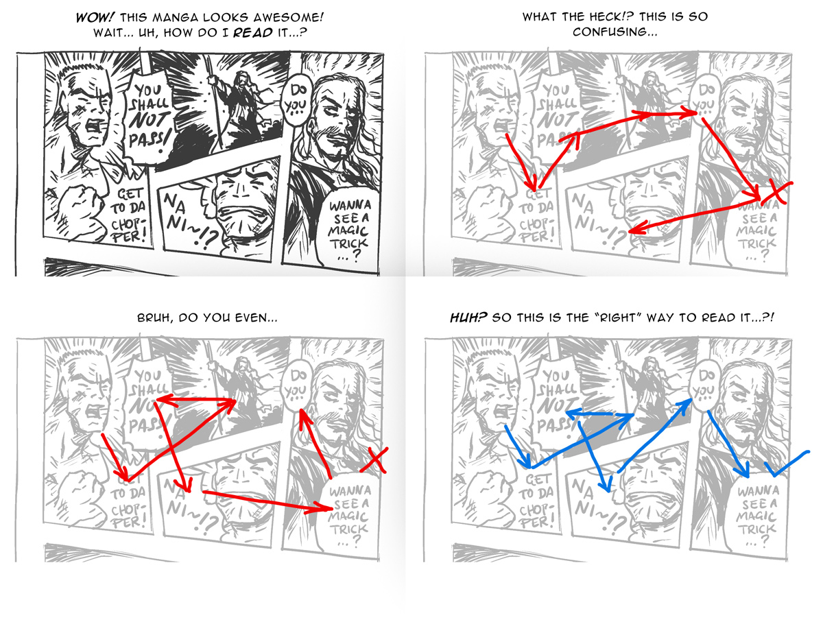
Stick to the plan
When the reading flow allows for multiple visual paths, it becomes difficult to follow the action. As a result, the reader gets tired and has a tough time immersing themself in the story. Plan the reading flow of every page carefully and make it as clear and linear as possible.
Communicating your story clearly to the reader is one of the basics of a professional manga. It's one of those things that you don't notice when it's done right, but becomes really annoying when done wrong.
PRO TIP 2: Plan your reading flow from the start and don't experiment with it.

Backgrounds exist for a reason
It's common not to draw backgrounds in manga panels and instead use effects to convey a particular emotion or atmosphere.
That's perfectly legitimate, in fact it's something that really distinguishes manga from other types of comics. But that doesn't mean you can omit the background all the time.
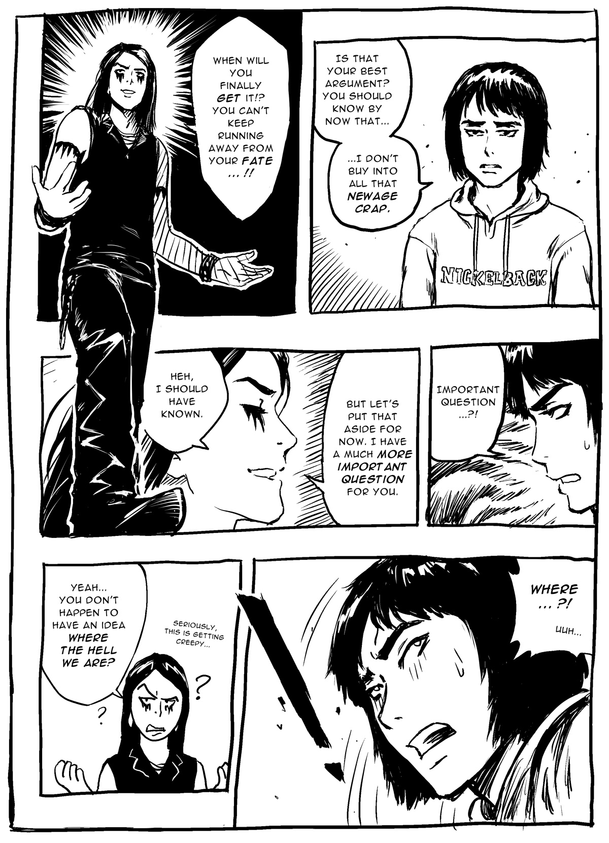
The best practice is to draw a background for your first panel of every scene and then show it periodically whenever it makes sense; especially when your characters are moving around.
As you can see in the following page, it's perfectly possible to draw a decent manga page without any background whatsoever, but it might feel disorienting and "off".
PRO TIP 3:
Remind your readers regularly about where your characters are by adding a background to your panels.

Use perspective in your favor
The beginner uses the same camera angles over and over again.
The pro tames perspective like a wild beast to crush their enemies.
Recycling the same viewing angles gets old very quickly. What's more, it doesn't help to utilize the full potential of the scene.
Learn how to use perspective in your favor, focus the viewing angle on what matters.
Pay attention to the camera angles used in movies or even start shooting your own photos from interesting and unique perspectives. It's said that a master can even shoot a lone egg in an interesting manner.
Get really close or far away, use the bird's or worm's eye view; There are countless possible angles to show your scenes from.
What's important is to use the appropriate angle for each scene. There's nothing wrong with a simple but solid two-point perspective if the situation calls for it. But consider more dramatic angles for when the action happens.
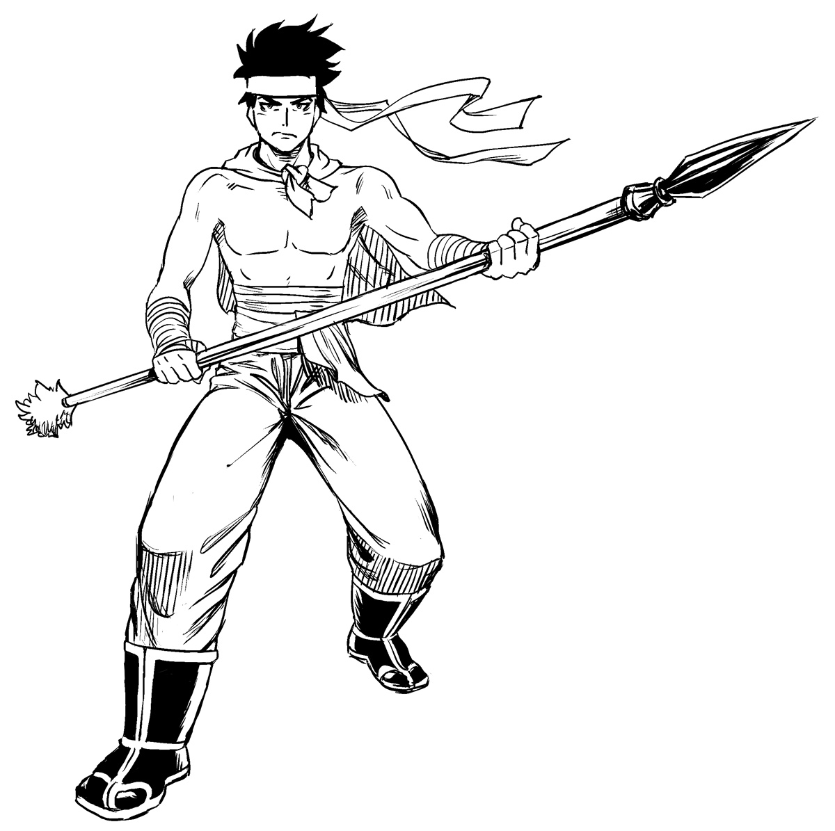
Regular angle
Let's take this drawing for example. It's not bad. But the camera focuses on him as a whole. It's looking quite balanced, but also very "normal". Where's the suspense?
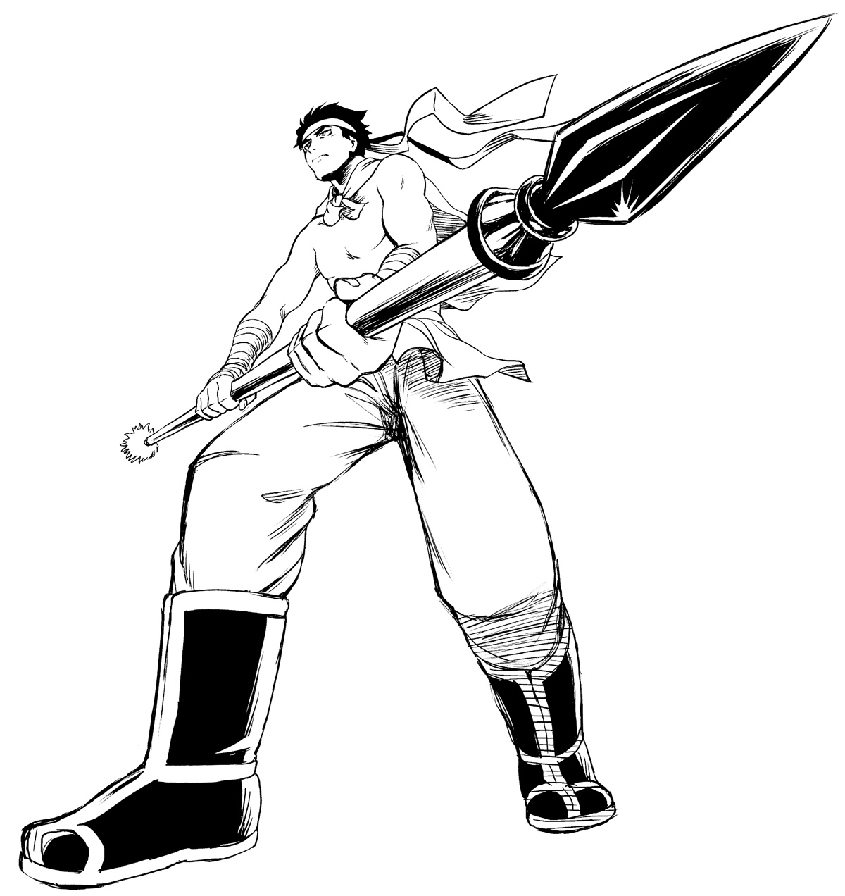
Epic angle
Now we're getting somewhere!
By using a low perspective with more distortion, we make the character look "larger" and more awesome. Furthermore, the weapon looks as if it's about to touch you, which really catches the viewers eye.
Surely this is a much more fitting angle for a heroic character.
PRO TIP 4:
Use interesting angles to show your characters and scenes from their best side. Focus on what you want the reader to notice most.

Everything is relative
The beginner will start drawing without first thinking about how big everything should be compared to everything else.
As a result, a house or a tree might end up looking only slightly bigger than a person.
This may be fine for a gag-manga, but in general, a pro will plan out the proportions of the elements in a panel before starting to draw it.
It's not necessary to think in terms of specific units; All you really need to think about is how big something is relative to something else.
So a character might have a size of 1.5, while a door may be 2.0, a house 5.0 and a tree 7.00.
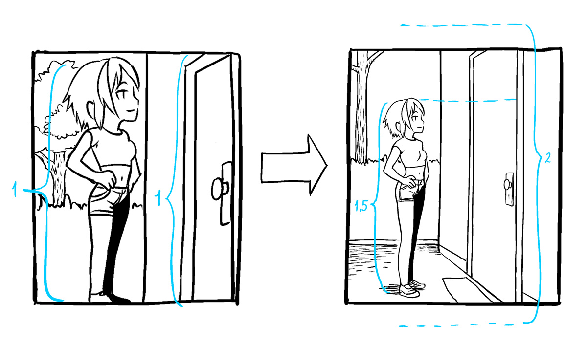
PRO TIP 5:
A pro doesn't start by drawing the characters head only to find that they won't fit inside the panel, and then change the proportions to "make it fit". No, a pro will determine the relative scale of everything before starting to draw.

Use rim light to add depth to your characters in dark scenes!
Every now and then, you will need to draw some (literally) dark scenes.
A beginner will be tempted to simply put a dark screen tone over the drawing, but this will make it look dull.
A pro will apply a technique that many professional photographers use to add a dramatic atmosphere to their shots: rim light.
Basically, rim light is a thin stroke of light that outlines the subjects contours, which is caused by a light source almost directly behind it.
Unlike a normal outline (which you should also use to seperate the background from the characters), rim light has a more organic feel to it and accentuates the form of the subject.
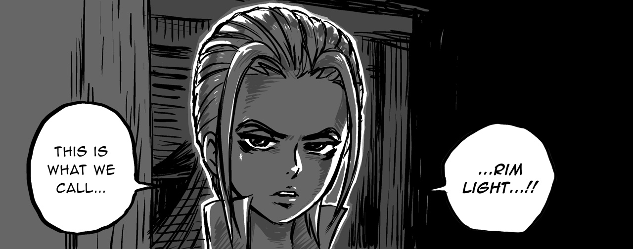
PRO TIP 6:
Use rim light to prevent your characters from looking flat and dull in dark environments.

Start with thumb sketches!
The beginner artist is impatient. They will start drawing a page without fully considering how all elements interact with each other, thus creating a page that looks unbalanced or even chaotic.
A full manga page is fairly large, a lot of stuff can be going on there, and it's not easy to look at it as one homogeneous entity when drawing it.
That's why a pro will begin by quickly drafting very small, rough thumb sketches for their pages.
This way, it's much easier to view the page layout as a whole. Because thumb sketches are so small, there's no chance of losing yourself in the details. You can fully focus on the big picture.
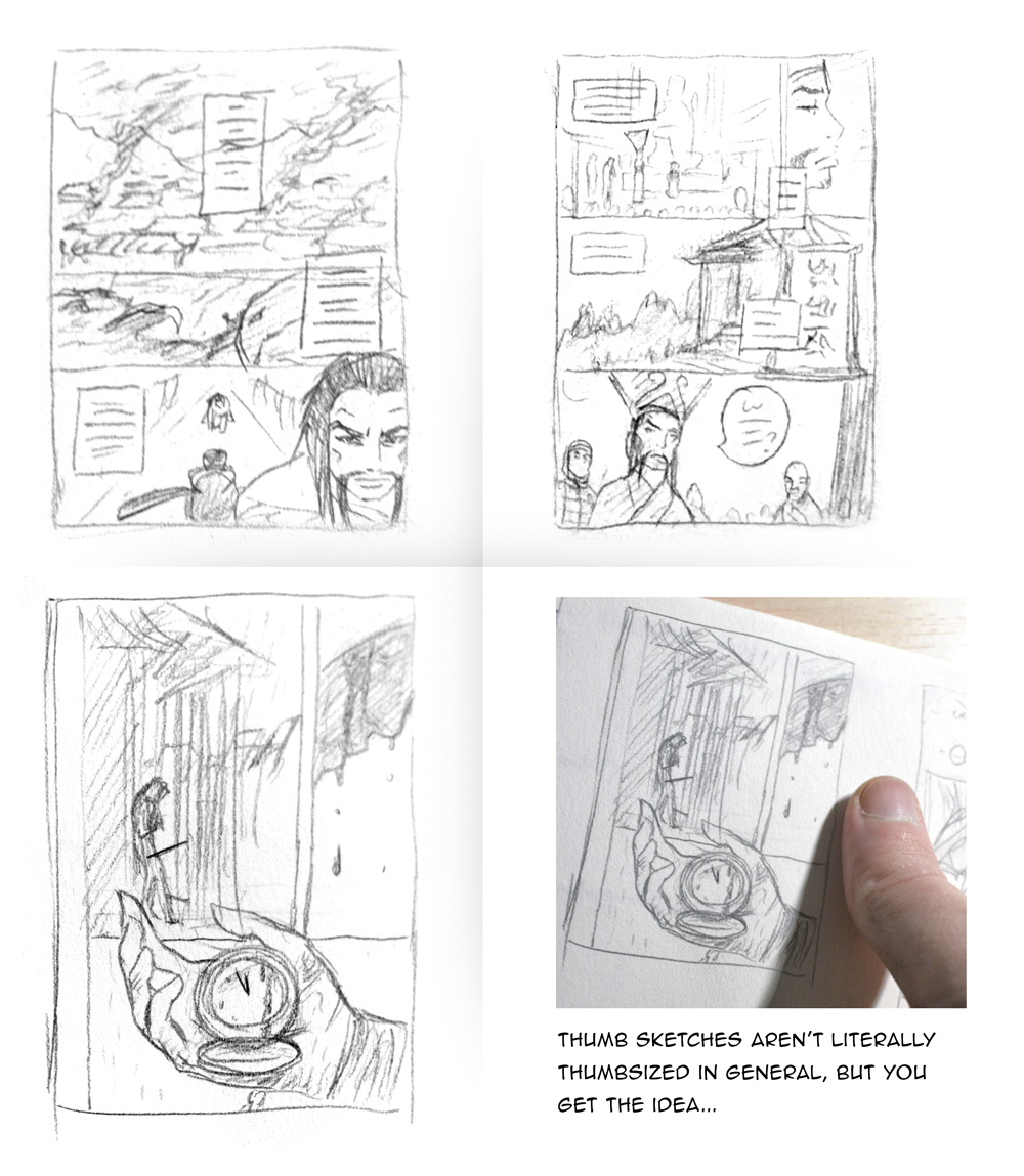
PRO TIP 7:
Always plan your pages from big to small. Don't lose yourself in tiny details before you haven't established the overall layout. Thumb sketches can help to ensure that a page looks right as a whole from the start, when it's still easy to make changes.

Most things aren't really the way they seem!
The beginner artist assumes they know how to draw everything right.
The pro assumes that they don't and checks to make sure.
Assumptions are those things that are extremely helpful, because we can't check everything to confirm that we understand how it works. But for an artist, assumptions are natural enemies.
Our brains are brilliant at recognizing stuff around us, but we only consciously remember very few characteristics of everything that we see.
That's why whenever someone attempts to draw an eye for the very first time, it doesn't look like a real eye at all.


Use references!
Quite often, the only thing that seperates an amateur from a pro is the fact that the latter uses references.
No one knows how to draw every single thing. And that's okay.
Don't know how to draw a lamborghini? Use a reference. Can't get a particular hand position right? Use a reference.
There's no shame in using reference images, especially when your manga is set in a historical period.
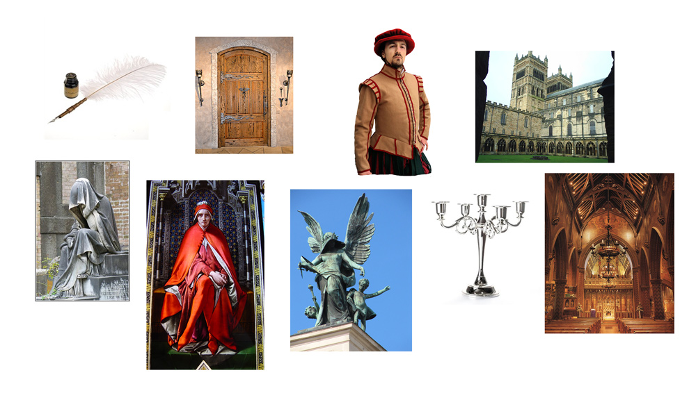
PRO TIP 9:
Being able and willing to use reference images is a fundamental skill of every manga artist. Acquire it.
Just remember: Using references is not the same as copying or tracing images. Rather, think of references as an aid to understand how a particular thing works or looks like, so that you can draw it more convincingly.

It's only "style" when it's consistent!
The beginner keeps re-inventing the wheel with every drawing.
The pro takes some extra time to create a refined wheel that doesn't need re-inventing.
...and by "wheel" I of course am talking about all the designs used in a manga: characters, scenes, clothes, etc.
Experimenting with your character designs and other things is very important, but you should do it seperately from your actual manga pages.
For an optimal reading experience, it's vital that all your designs stay consistent across all panels and pages. Even if you find a much better way to draw a particular thing, you can't just change it midway. Instead, evolve it slowly across many pages.
A common excuse many beginners use to justify their drawings is: "That's my style!" That's fine, but only so long as your style is consistent and doesn't change at random.
This is why pro's put a lot of time and effort into planning their designs, by creating reference sheets to use for themself.
Before even starting with your manga, you should draw all important characters, weapons and such over and over again, from different angles and in different states.
This is incredibly important, because drawing manga pages takes a long time and without a constant reference, you'll be at a risk of slowly altering your designs over time, without noticing it.
Reading takes place at a much faster pace than drawing, so subtle changes in the way you draw a character are often much more evident when you read a manga than when you draw it.
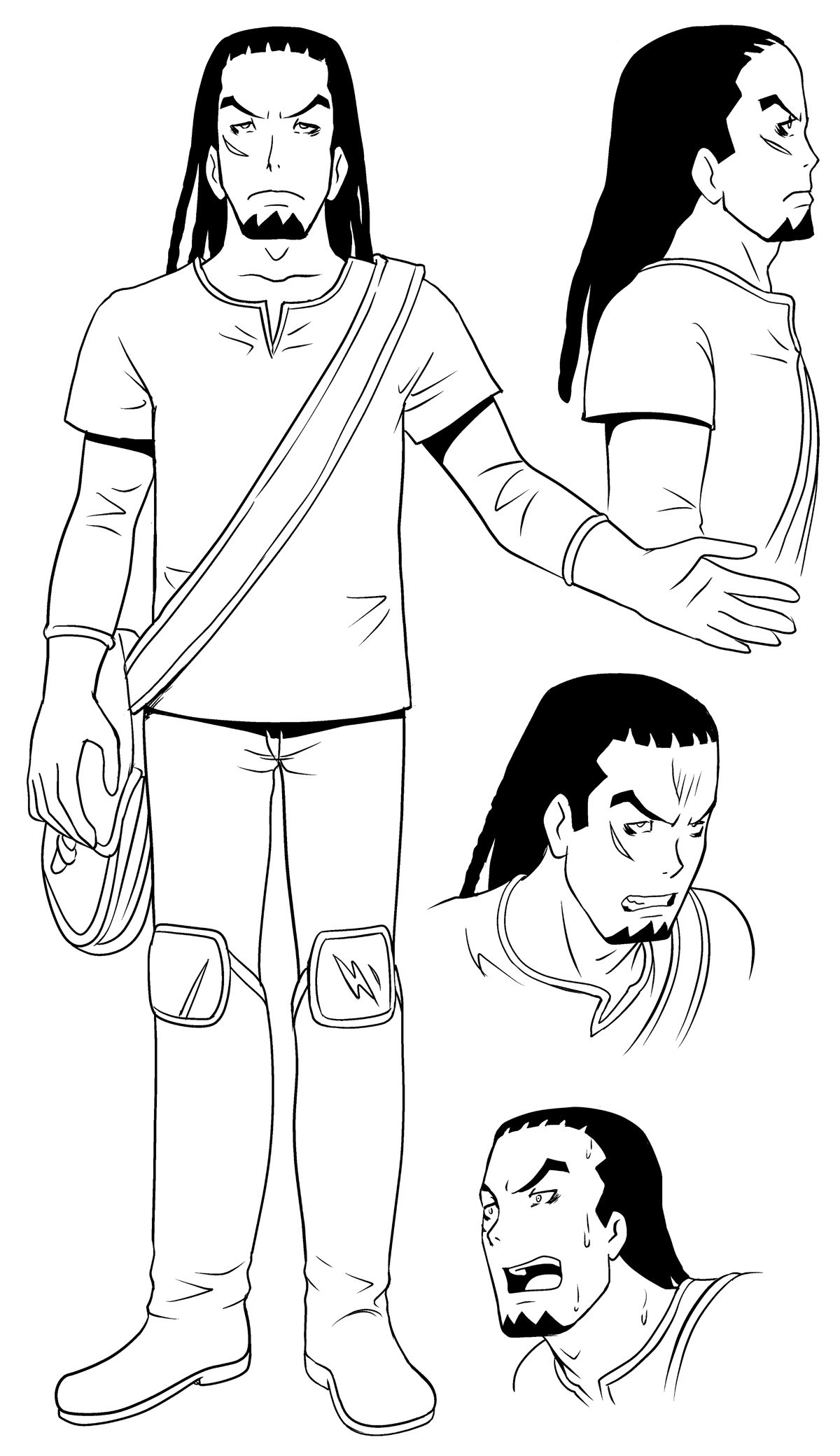
PRO TIP 10:
Even though it takes extra time and effort: Make sure to create reference sheets for all the important designs of your manga, and keep them close. Consistent drawings is arguably what helps the most in making a manga look professional.
Outro
Hopefully, these 10 tips have given you some inspiration as to what you should focus on the next time you draw a manga page, in order to make it more professional.
What was new to you? Which practices have you already been applying? And what are YOUR pro tips? Let me know in the comments below.
Comments
You need to be logged in to write comments.
thanks
This was very helpful!
The good thing is that you will also be able to obtain the chance to go filmy which means you will be accompanying with beautiful Call girls in Delhi who are not less than any other models or actors.
https://www.erosescorts.in
https://www.erosescorts.in/delhi-escorts-offer-hot-call-girls-with-full-satisfaction/
https://www.erosescorts.in/enjoy-the-best-ghaziabad-escorts-service/
https://www.erosescorts.in/most-reliable-and-reputable-dwarka-escorts-agency/
https://www.erosescorts.in/draw-your-sensual-satisfaction-through-aerocity-escort-service/
Thank you for sharing excellent information. Your website is so cool. I am impressed by the details that you have on this website. Check the link for more information.
Visit us:
https://angelhotnight.com/
https://angelhotnight.com/dwarka-escorts/
https://angelhotnight.com/aerocity-escorts/
https://angelhotnight.com/nehru-place-escorts/
https://angelhotnight.com/mahipalpur-escorts/
Thank you so much for this!
Thank you so much! Just a beginner and looking for ways to improve my drawing skills. This was definitely a great help! Time to practice my primitives and perspectives! 😁
Thanks so much, this was really straight to the point and very helpful
I knew most of them, but I always check tutorials like these and seems I am right to do so: I didn't know the thumb sketch thing and had been wondering for a while how I was going to manage organizing my pages. So it's pretty helpful... :)