Short★Inks » Marker Colouring: advanced techniques
Step 1
Marker Colouring advanced techniques: a walkthrough on "how to colour with markers"
Hello and welcome to my marker tutorial!
This tutorial is a step by step guide for those who want to see how a picture is done from the sketch to the finish using markers on an alcoholic basis. I hope this tutorial is understandable and of some help to you. :)
Enjoy!
* The Tria markers mentioned in this tutorial are the old version and not available in shops anymore.
Step 2
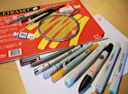
First off I am listing the different materials I used to create the image.
1 - mechanical pencil size 0.5, lead: HB
2 - a normal plastic eraser (soft) and a pencil eraser for precise erasing
3 - Copic multiliner sepia, size 0.05
4 - Copic multiliner black, size 0.05
5 - Copic ciao (two nibs: broad and brush)
6 - Copic classic (two nibs: broad and thin)
7 - Copic sketch (two nibs: broad and brush)
8 - Tria marker (three nibs: broad, thin and very thin)
9 - Copic "Blender" classic, number "0"
10 - opaque white (I used water colour opaque white)
11 - a round brush, size 00
12 - a round bristle brush
13 - a round screen
14 - marker paper, size A4
While I go through the tutorial, I'll give you the colour codes of the markers; to Copic ciao markers I'll add "c" and to the Copic sketch markers a "s". The colours of Tria markers look like "370-T", so you won't mix them up with the Copics. ;)
Just one more thing:
Be very careful with the markers since you CAN'T
Step 3
I guess I don't have to tell you how to do the sketch. ;)
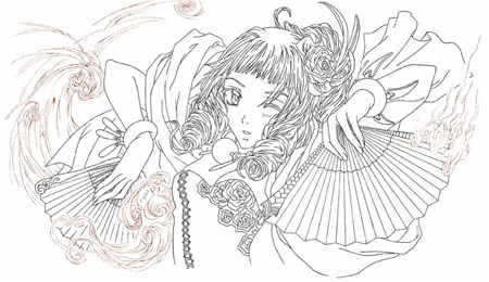
Anyways, once the pencil sketch was clean and finished I started to draw the outlines with the Copic multiliner black (size 0.05). For the wind I used the Copic multiliner in sepia (size 0.05) to get a softer feel.
Overall I only draw "single" lines and don't add any dynamics (broader strokes) to the outlines just yet. The only reason for this is that when you add broader parts to the lines, the marker can pick up the colour and you'll end up with smudgy black or sepia in the applied colour... and you'll be furious.
When you are finished with the outlines, you erase the pencil and make sure you get everything. You won't be able to remove pencil lines once colour is on them.
Step 4
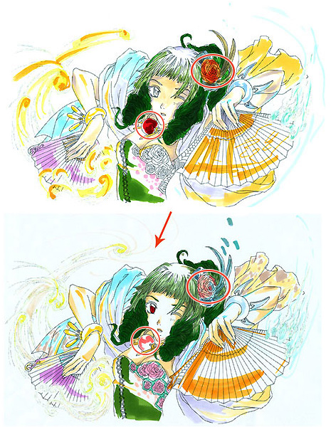
Before you start colouring a marker picture, it's always good to make a rough colour sketch first in order to see if the colours you had in mind really fit together. Quite often the image looks really good in your head but once on paper, you'll find it's not always the case.
I know it's obvious but as a precaution: Don't draw on the outlines! Either trace the outlines roughly on another piece of paper or make a copy of them (it doesn't have to be a good one).
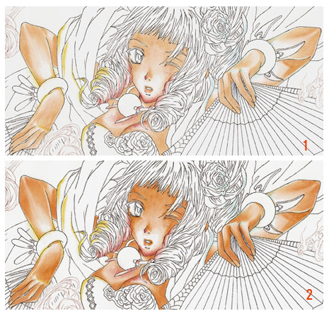
The first picture shows the colours how I imagined them but the orange flower in her hair is too obvious and the orb around her neck would take away her red eye colour...
So I decided to change the colours for a more balanced colour scheme. The 2nd image looks better, ne? :)
Step 5
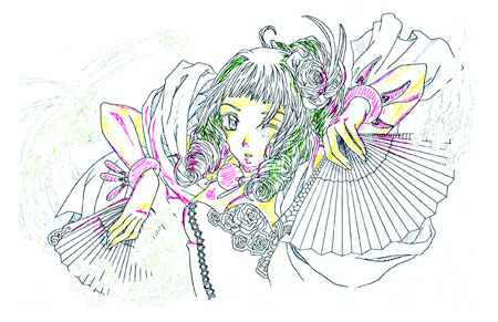
Another thing I love to do before I actually start to colour an image is to mark the spots where shadows should be or particular highlights, keeping the light source(s) in mind. It helps a lot later on when colouring.
For this image I wanted to have three different light sources which emit an irregular glow (bracelets, orb). I marked those three objects and where some coloured glow should be seen with a pink fineliner. Yellow stands for the rest of the shadows that still follow those light sources. Well, and green stands for the darker parts in the hair. Single strands of hair are not important!
It doesn't really matter what colours you use but they should be easily visible; never mind strange colour compositions as long as you know what they stand for.
Again: Don't use the outlines for this!
Step 6
Now comes the fun part, the COLOURING! :D
I always start with the skin colour as it is mostly the lightest area on a picture and you won't run into trouble with dark colours e.g. the marker picks up some of the dark colour and smears it all over.
Rule: Always work from light to dark!
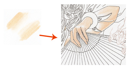
Ok, in order to achieve the gradual fade from the base skin colour I used the Blender 0. Since the Blender does not include any colour, in fact it's totally colourless, you don't need to worry if you go over the outlines if there isn't any bordering colour.
First I "coloured" the skin area with the Blender until it looked wet. Then I used E00 to create the fading effect by leaving out parts that were supposed to be white and built up the colour from there as you can see in the little image. Sometimes I had to go over the coloured part again to make it darker. For this step I needed to work fast so that the colour does not to dry.
It's good to do one part of the skin at a time (marker colours
Step 7
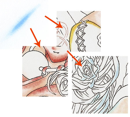
Again I used the Blender for the coloured reflection of the bracelets and the orb. It's practically the same technique as above with the only difference that the Blender is applied first and the colour gets darker in the middle. On the wet Blender basis I put a first coat of the desired colour and added a second and third one which each got smaller in size. All was done relatively quickly again.
Y21 was used for the reflection of the yellow bracelet, B32 for the blue one and R02 for the orb.
Step 8
image 1
I applied the second coat of skin colour with E51c to create more defined shadows with the brush nib.
image 2
E02 was used to darken the shadow but I only used the colour where it was necessary e.g. under the fringe.
Step 9
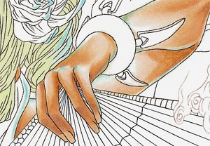
Lastly I added BV31c to the shadows on the skin to give the skin colour more depth. This blue violet picks up the colour from the scarf but cold colours also are a good contrast to warm ones. ;)
G40 was used as the basic colour for the hair.
Occasionally I darkened some of the light reflections on the skin with the same colours as above where I felt it was needed.
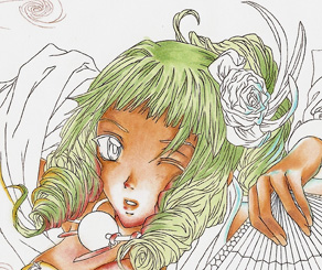
Step 10
Now comes the second coat of the hair where strands and shadows are modelled with G21.
I didn't colour the parts of hair in which another base colour will be added. This is something you should keep in mind because only a few layers of colour are possible on marker paper before it "rejects" any more colour. Be careful there!
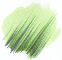
Step 11
The last step on the light hair was to add single strands and to darken shadows even more. For this I used BV31c, BG93c and BV23c (the order is from light to dark).
Here the brush nibs became really handy as they are perfect for drawing strands of hair.
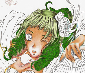
Step 12
The base colour for the darker part of the hair is G07. I coloured it in very carefully so that it looks like the hair gets darker strands.
The rest of the hair was coloured just as in step 10 with the exact same colours (BV31c, BG93c, BV23c).
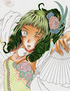
Step 13
This step is only about the base colours for the dress and the flower in the hair. :)
Dress: G40
Pattern & Inlaid Textile: R32
Flower on Dress: RV21
Border Strip: BG24
Flower: R32
Leaves: 549-T
Long Leaves: 563-T and 2707-T (”mixed” in that order!)
Step 14
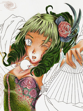
Now comes a more difficult part as I had to be quick (wet-in-wet technique) as well as being very precise. So, in order to get a result like this on the dress I used five colours to blend because it gets far more awkward to blend dark colours (more colours needed) than light ones.
The Wet-In-Wet Technique is basically the same which I used with the Blender but with more markers this time. Remember: the colours can't dry or it won't really work.
The blended colours in order are: G40, 365-T, YG23, YG25 and 370-T.
After the blended colours did dry I added the shadows on the green part of the dress with YG91c and BG93c. I applied the dots with BG93c (green parts). The shadows on the ornaments were added with the same colour as before and on top of it I put some "shadows" with BV31c and BV23c. Here the dots were done with BV23c.
I also added shadows to the flower in the hair with the same colour as the base colour
Step 15
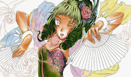
Onto the scarf! :)
The little image shows you how I added the three colours "with patterns" of the scarf. I needed to work neat so that the colours didn't overlap.
End of the Scarf (both sides): 475-T
Blue Part: 2707-T
Violet Part: BV31c
Yellow Part: 1205-T
The base colour for the orb around the neck is R11.
Step 16
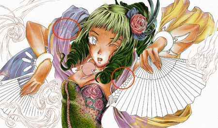
Folds were added with the brush nib of BV31c in two layers on top of each other. Because it is supposed to be thin fabric, I put quiet a lot of folds in.
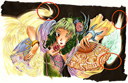
I traced the borders of the pattern again with the same base colour and the very thin nib of the Tria marker as seen in the top red circle. The only different colour I used for tracing was 481-T for the pattern on the ends of the scarf.
I also gave the scarf some greenish shadows with YG91c and BG93c; and a very tiny bit BV23c.
Step 17
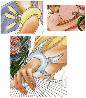
I think I don't need to explain anymore how the Blender is used, right? ;)
Again, the Blender is the base for the colours of the bracelets to create a slight fade.
Blue Bracelet: 2707-T
Golden Bracelet: 1205-T
I coloured the golden pendants on the necklace with Y21, Y26 and YR24.
To the fingernails I added E11 and E33.
Step 18
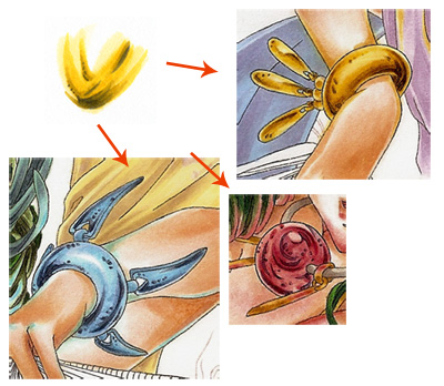
In order to get a metallic feel for the bracelets and a gem touch for the orb, I put two to three layers on the existing one.
Blue Bracelet:
B32, B45 and I added B00 over both colours to blend them better. The dark/sharp details were added with BV23c.
Golden Bracelet:
Y15, Y26; dark details with BV23c
Orb:
RV21, R32; dark details with BV23c
I used Cool Gray 10-T for the lacing on her top and it's shadows.
Step 19
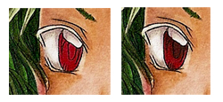
Eyes & Mouth
The basic eye colour is R37 whereas the white part of the eye needs some shadow too. Here I used the Blender and W3. On top of that I added BV31c for some defined shadow leaving some of the colour underneath visible. After this was finished, I used 202-T (very thin nib) for the darker pupil.
The mouth/tongue is coloured with E07 and 170-T while the shadow was done with the same colours.
Step 20
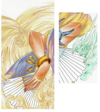
We are now coming towards the last steps of colouring. ^^ Next is the wind.
I used E40s for the softer breeze and BG11s for the strong wind and in both cases were the brush nibs very helpful. I also added the coloured reflection on both fans like I did in step 6. It's the same colours (Y15, B32) as well.
Step 21
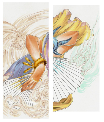
A second layer with the base colour was added to the bluish wind and the darker parts were done with BG34 whereas only Y00c enhances the yellowish touch on the soft wind.
Step 22
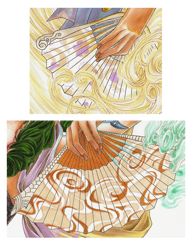
The last things I coloured before I went onto the background were the two fans. I decided that they should reflect the different types of wind which is why I drew a flowery pattern on the "violet" and a swirly pattern on the orange/brownish fan. Due to the fact that I wanted a more complicated pattern on the orange fan, I traced the fan shape on a separate piece of paper and added the pattern as a rough guide. Since marker paper tends to be very thin I just put the pattern directly under the original outlines so that the black lines were shining through. After that I used the colours according to the pattern. ;)
Violet Fan:
E40 (crescent shapes)
264-T (flowers)
Orange Fan:
475-T (bright parts)
481-T (border for bright parts; very thin nib)
Y38 (upper part of fan and crescent shapes)
YR23c (crescent shapes)
"Wood" on both Fans:
Warm Gray 2-T
Step 23
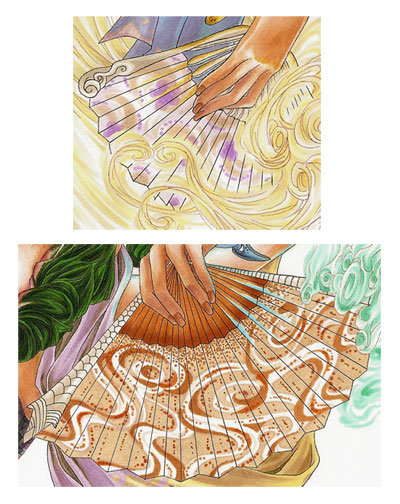
More details and depth were added in this step to the fans. The "wood" got some shadows with Cool Gray 7-T and the very thin nib.
I used some Warm Gray 2-T (very thin nib) for additional swirly patterns on the violet fan, again 264-T on the flowers and on top of those BV31c to give it a silky feel (a slight fade to the top and bottom of the "paper").
I gave a second coat to the bright areas on the orange fan with 475-T, added a subtle fade to the orange part and dots below with YR23 (brush nib).
Step 24
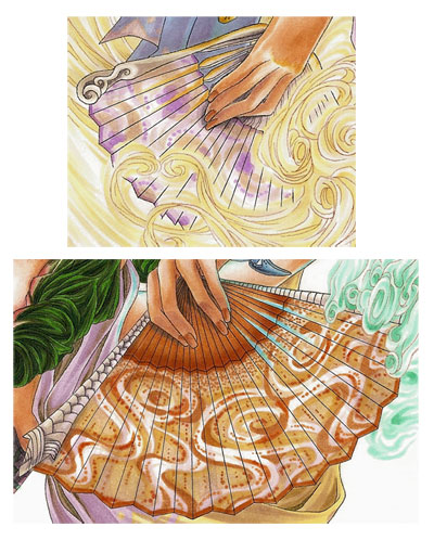
More dark parts...
"Wood" on the Fans:
Warm Gray 8-T (very thin nib)
BV31c (brush nib)
Violet Fan:
BV31c (for more fade)
264-T (borders of the "paper")
Orange Fan:
Y00c (added to the bright parts for me yellow)
YR23c (dots and borders of "paper")
BV31c (fade on top and bottom of "paper")
BV23c (shadow near the wooden part and under the hand)
Step 25
We are finally drawing to a close with the markers. :D
Well, since the picture is already very detailed I decided on a simple dark background so that the colours will "glow" a bit more.
As you can see I needed the wet-in-wet technique again for the parts with the wind. Here I had to be really careful because I didn't want to have a huge fading area and nearly black colours are very awkward to blend.
So in the order from light to dark I used: Blender, W3, W5, W7 and W10
I also used W10 to colour the rest of the background.
Step 26
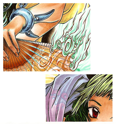
The image in the last step looks a bit strange with those tiny and thin outlines... That's what we are going to change now.
This time I added dynamics to the outlines with the Copic multiliners black and sepia (both size 0.05); and I did fill in the parts which were supposed to be black e.g. the eyes. For this I had to trace every single line again. It's quiet a lengthy process but it's worth it!
Step 27
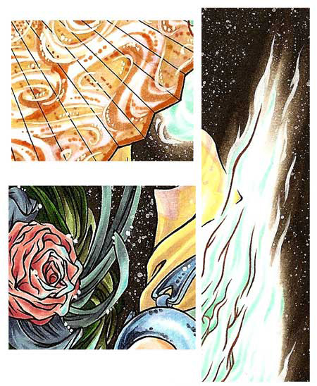
The very last step was to add some sparkling particles or whatever you want to call them.
The little images show you what I added with the opaque white. I used the small round brush (size 00) to add details to the orange fan and little dots on the the flower in the hair or the eyes. I also enhanced the wind with it.
Finally I added sprinkles to the rest of the dark background for which I used the round bristol brush and the screen. It's important to cover the drawing where you don't want any colour splatters. Since I still had one untouched copy of the original outlines, I cut them out and put them on top. It's that easy.
One thing you should keep in mind is that the opaque white for the use with the screen can't be too thick (no sprinkles then) or too thin/too much water (you'll end up with a big white blob on your drawing -_-). Always test the colour consistency first!
Step 28
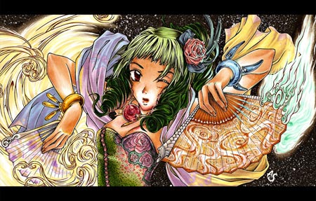
Some rotating, tweaking of the colours (scanners love to eat colours or to display them wrong), adding black bars to give the image some movies kind of feel...
...and VIOLÁ! The picture is finished! :)
That's it!
I hope you can find this tutorial useful and it should have given you an insight of how I work with markers. Thanks for reading!
Kiwi out!
Comments
No comments yet. Be the first to share your thoughts!
You need to be logged in to write comments.