Ali's Tutorials » Drawing Manga Pages
Welcome to "Drawing Manga Pages" with Ali!
The purpose of this tutorial is to show you the process behind drawing (more or less) professional manga/comic pages!
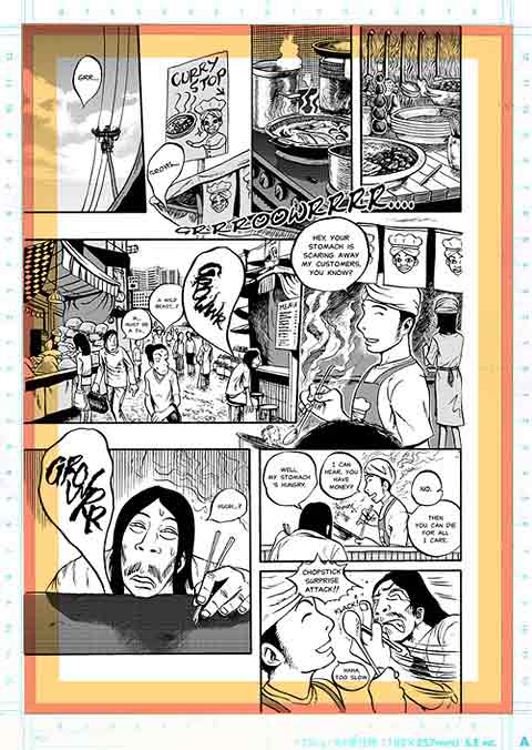
I will use the first page of my short story (Karma) for this.
I hope you‘ll enjoy this tutorial and learn the one or other new trick!
Page Template
First of all, since a manga page is supposed to be printed and trimmed afterwards, we have to be careful of our layout.
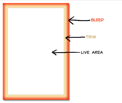
For printing, a page is separated into three areas:
The bleed area will be cut off 95% of the time, so make sure not to have anything important there.
The trim area is where the page will be trimmed (who would have guessed XD), so there‘s a chance that something of it will be cut off. Therefore it should not contain any truly relevant elements like text or characters faces, etc. either.
The live area is the main part of the page. Everything important goes here.
Keep in mind that all publishers and print-shops have their own specifications, better check them out for the exact format before you start drawing your pages.
TIP
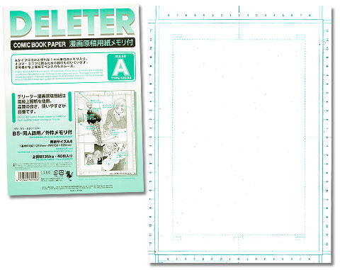
If you want to make this step easier for yourself, you may want to use special comic book paper.
Nowadays it‘s quite easy to find via the internet and it‘s fairly affordable.
The advantages of this paper are:
1) the pre-printed guidelines and rulers make it much easier and quicker to draw panels. The bleed and trim areas are marked.
2) the paper is of high quality so you can erase often without damaging it and the ink won‘t bleed.
And no, I don‘t get paid by Deleter for saying this.
Really... XD
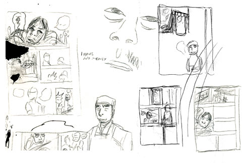
Scribble!
Now, let‘s start drawing our page!
First, we need to find out what the content of the page should actually be and how it's supposed to be arranged in the layout.
For that purpose, you may want to do a series of small thumb sketches.
At this point, try not to get lost in details. It's much more important to get the general look of the page right than a particular item or character.
Don‘t be satisfied with your first idea! Try out a couple of variations. Chances are, your tenth scribble will look way better than your first!
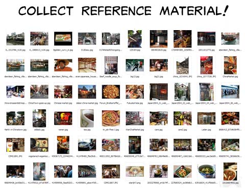
Reference material
Okay, now that we have a good idea of how our page should look like, it‘s NOT time to draw it yet XD !
First it‘s time for research!
This step is often underestimated, but it‘s essential. If you want to create a convincing scenario, searching for reference material is totally unavoidable. Don‘t expect it to „end up looking right somehow“ XD .
Luckily, getting reference images isn‘t much of a problem thanks to Google, iStockphoto, etc.
You can see on the left that i found quite a bit in a short amount of time =)
With this material it‘s now a whole lot easier to draw impressive backgrounds and designs.
But try to use these images as nothing more than an inspiration for your own designs. It's easy enough to copy an image, but if the result ends up lacking your own style and personality, what's the point, really?
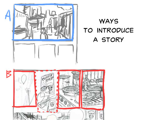
Introducing the reader to the story
Using our previous sketches as guides and the reference photos as inspiration for our designs it's finally time to draw the pencil draft!
Usually the first page of a manga acts has the purpose of introducing the readers to your story.
A great way to achieve this is by presenting the location where your story takes place.
You can do so by showing a long shot of the whole scenery as in image A.
Or you can break it into pieces and use a series of small panels to show „still life“ pictures (image B).
By showing only a few select details the feeling of „being there“ and looking around can be even intensified.
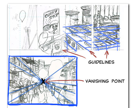
Grids & Guidelines
The pencil draft doesn‘t have to be a piece of art, but the more effort you put into it, the easier the inking process will become.
Guidelines and vanishing points are excellent ways to get the perspective right.
Without them, it‘s very easy to make mistakes, no matter how experienced you are.
They may be a little bothersome to set up, but in the end you‘ll more than likely safe yourself a lot of frustration... and erasing XD .
The lower panel is a wide shot of the market place.
As you can see, I used (a rather loose) one point perspective for it.
People as well as buildings and other objects should all be aligned along these lines (or they will look like they're floating in the air or are stuck in the earth XD).
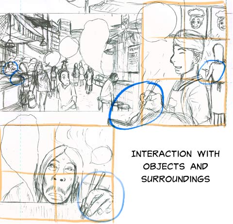
Interaction
After we've introduced the scenery, it's time to get to the characters!
These panels‘ job is to present characters to the reader, usually in a portrait-like way. This means that ideally they should be positioned in the center of the panel and be shown from head to bust, hip or even full-body.
A very important thought to consider:
What are your characters doing?
Yes, it's easy to draw a character who's just standing all cool and not doing much, but if you want to bring them to live, you need to occupy them with something!
Interaction is often tricky to draw (look for reference images or at yourself or a friend when in doubt). But don‘t avoid drawing interaction!
Even when there's nothing to do, people tend to lean on walls, straighten their neckties, do stretch excercises... and so on and so forth.
And if you can even get your characters to do things that reveal something about their personality (nervous finger tipping, eating with an open mouth and crumbs all over...) you're gold.
Conversation
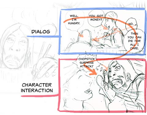
The last two panels show a conversation between these two characters.
In manga time flow and reading direction are intertwined.
Therefore it‘s important to arrange the speech bubbles in the proper order to communicate the events clearly.
In the upper panel you can see that the dialog proceeds in turns.
The tails of the speech bubbles play a very important part here, as they show which character each bubble actually belongs to.
The tail of the third bubble is inverted; it signals that it „skips“ the character next to it and belongs to the one farther away.
It is useful when a panel has lots of speech bubbles and you want to make it not impossible to follow.
The lower panel shows a bit of action between these characters; body language.
Always remember that characters can not only talk, but also express themself with their bodies. Make use of that!
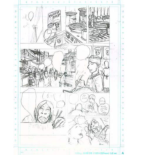
Inking
My usual inking procedure goes like this:
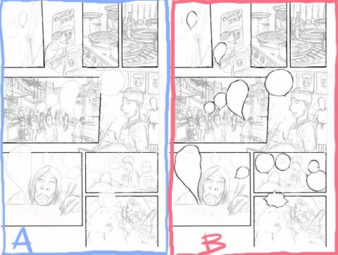
I begin by outlining the panel borders with a fineliner and make sure to leave spaces for speech bubbles that go outside the panels open.
Then I ink the speech bubbles with a G-pen.
With the G-Pen I can vary the outlines of the bubbles in width to make them more lively and dynamic. But it‘s really just a matter of taste how you want your bubbles to look like. If for example you want a cleaner and cooler look for them, using a fineliner, rapidograph or Maru pen would be better.
More inking
After the speech bubbles have dried, the contents of the panels are ready to be inked.
Hint:
If you want to safe your inks from smudges, it‘s advisable to work systematically from the upper left corner to the lower right corner (or vice versa if you‘re left handed).
Keep in mind that thick strokes can take very long to dry, so don‘t take 'em lightly XD
Line thickness
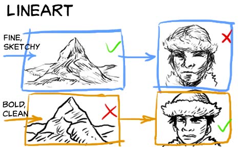
Well inked lineart doesn't only have to look nice, but also aid in making your scenes easier to understand.
Traditional black and white manga rely on clear lineart much more so than colored comic books.
For example, while very fine and sketchy lines may suit landscapes and objects, they make characters appear rather lifeless and hard to relate to.
A bolder, cleaner lineart on the other hand makes landscapes look stylized and unrealistic, but it gives characters more personality and makes them stand out.
By combining two or more types of lineart (you can use different pens and brushes to do so), your scenes become visually easier to grasp and nicer on the eye.
Contrasts
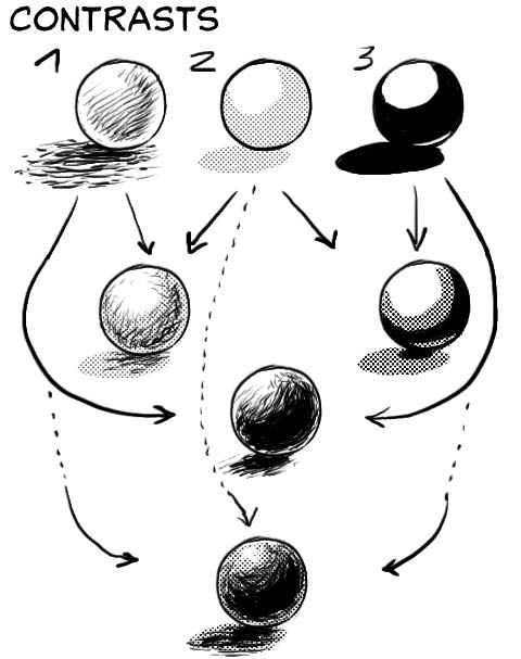
The important thing about contrasts is to maintain the right balance.
There are essentially 3 methods to create contrasts:
1) cross-hatching/fine details
2) half tones
3) black fills
All of them have their pros and cons (and proper uses).
However, if you rely too much on only one technique chances are that your pages will look lackluster...
Therefore it‘s a good idea to combine these methods.
No method or combination is the best. Use all tools available at your disposal!
Details
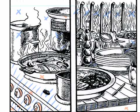
The idea for this two panels was to convey atmosphere, so I decided to draw these stills with clean, thin lines in order to make the details and designs distinguishable.
As you can see, quite a few areas are left white and will be either filled with solid blacks or with half tones later on the PC.
Inking the long shot
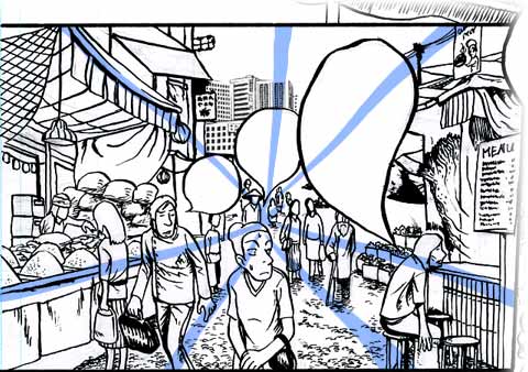
The establishing shot of the market place is a bit of a laborious piece to ink... but a good mangaka shan't be lazy XD
What we have to be careful about is adjusting the line width according to the distance, meaning: what's nearer to the viewer is drawn in thicker lines and the objects in the distance have to be drawn with finer lines.
That way we can enhance the illusion of depth and perspective immensely!
Inking the character
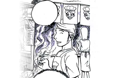
For the character introduction panel I chose to work with contrast in order to help him stand out from the background.
I shaded the background with simple cross-hatching (and afterwards with screen tones) while leaving the character mostly white.
Sometimes being a bit lazy can be good, as too much detail in the background can distract from what‘s really important.
Last panels
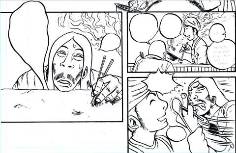
The last panels are fairly lazy, as well XD .
Rather than drawing the backgrounds every time, it's sometimes more effective to use speed lines or other atmospheric effects to set the right mood.
When it comes to a conversation, it‘s important to concentrate on the characters facial and bodily expressions. The speech bubbles usually take up a lot of space, too, so detailed backgrounds would be dead weight in this case.
In these instances it's often best to either leave the bg‘s blank or use screen tones (in some cases even a solid black fill will do the job).
Finished inking
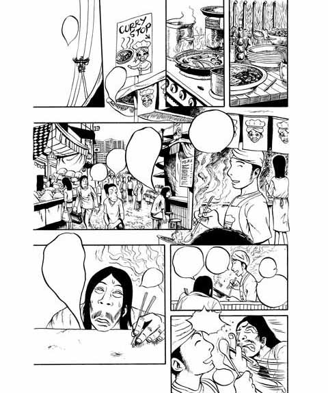
Once the page has been inked, it's best to leave it to dry for a while before scanning it.
After the page is scanned, we can use a software such as Photoshop or MangaStudio to fill in the blacks with the bucket-tool and correct mistakes in the lineart with the pencil-tool where necessary.
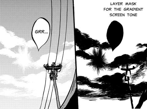
Gradient screen tone
The best way to simulate the look of the sky in a manga is usually by using a gradient screen tone, so that's what I did.
Here‘s my approach:
I create a new layer above my lineart, set it to multiply and fill it with the screen tone.
Then I add a layer mask on top of it and simply draw out the clouds and sun with the pencil-tool.
(The speech bubble and other stuff can be cut out by selecting them with the magic wand-tool.)
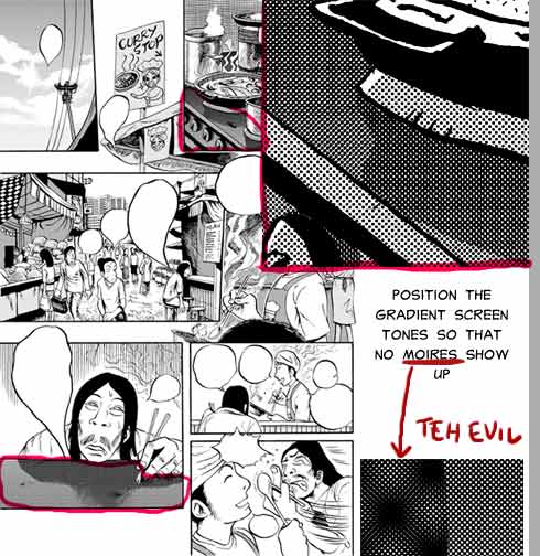
Screen tones
The rest of the page is basically toned in the same way.
However, when applying two screen tone layers over another, make sure to avoid moirés.
You can usually achieve that by positioning them carefully pixel by pixel until they are properly aligned.
Try to refrain from rotating the screen tone layers to stay on the safe side (rotating exactly by 90° or 180° isn't a problem of course).
And btw, the same thing i said to contrasts applies to tones: don‘t use too many different kinds.
On this page I used 3 types; a light one, a dark one and a gradient tone.
Sometimes texture and pattern tones can be nice, but again, try not to overuse them.
Many mangaka admit that they have a bad habit of using too many tones (...and because of that end up doing all-nighters to make it till the deadline XD )
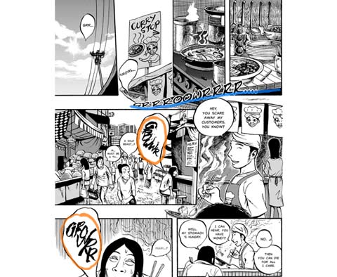
Lettering
The last step of the creation of a manga page is lettering.
Depending on what kind of manga or comic you make, it‘s not necessary to have a ‘typical‘ comic font consisting of capital letters. But it‘s wiser to use regular fonts unless you have good reasons not to do so.
Try to find fonts that visually complement your comics scenario and atmosphere.
Keep in mind that the text is also a part of the whole page layout.
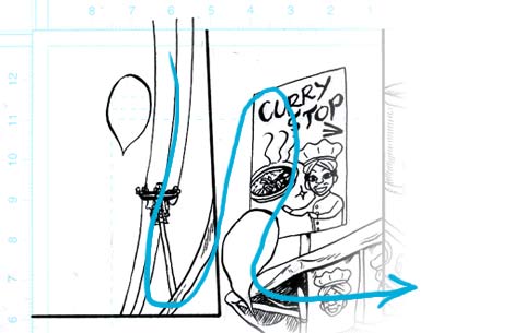
For example, I used the blue underlined soundword as an "arrow" of sorts to guide the readers eyes.
Some of the soundwords have been drawn with a brush in order to visualize the roughness of the sound.
Comments
No comments yet. Be the first to share your thoughts!
You need to be logged in to write comments.
